
Vision
Highly enlightened African talent providing world class solutions to humanity.
Case file 04 · Brand naming · Identity strategy · Brand manual
An e-learning platform for Uganda’s classrooms needed a name, a point of view and a rulebook. We gave it all three, then wrote them down in a 60-page manual.
01The briefNaming · Strategy · Manual
Sqillpad is a learner-centred platform for primary and secondary school learners following the Ugandan curriculum. It is Uganda’s first NCDC-approved e-learning community.
Learners can learn at their own pace. Teachers and parents need to trust it just as much. So the brand had to be easy to say, easy to remember and easy to apply, from a login screen to a school notebook.
Learn it simple.
It says what the platform does in three words, and it sits under the logo wherever the space allows.
02The nameNaming · The logo
One word, easy to say, with a logo that does two jobs: it shows learning growing, and it shows where that learning happens.

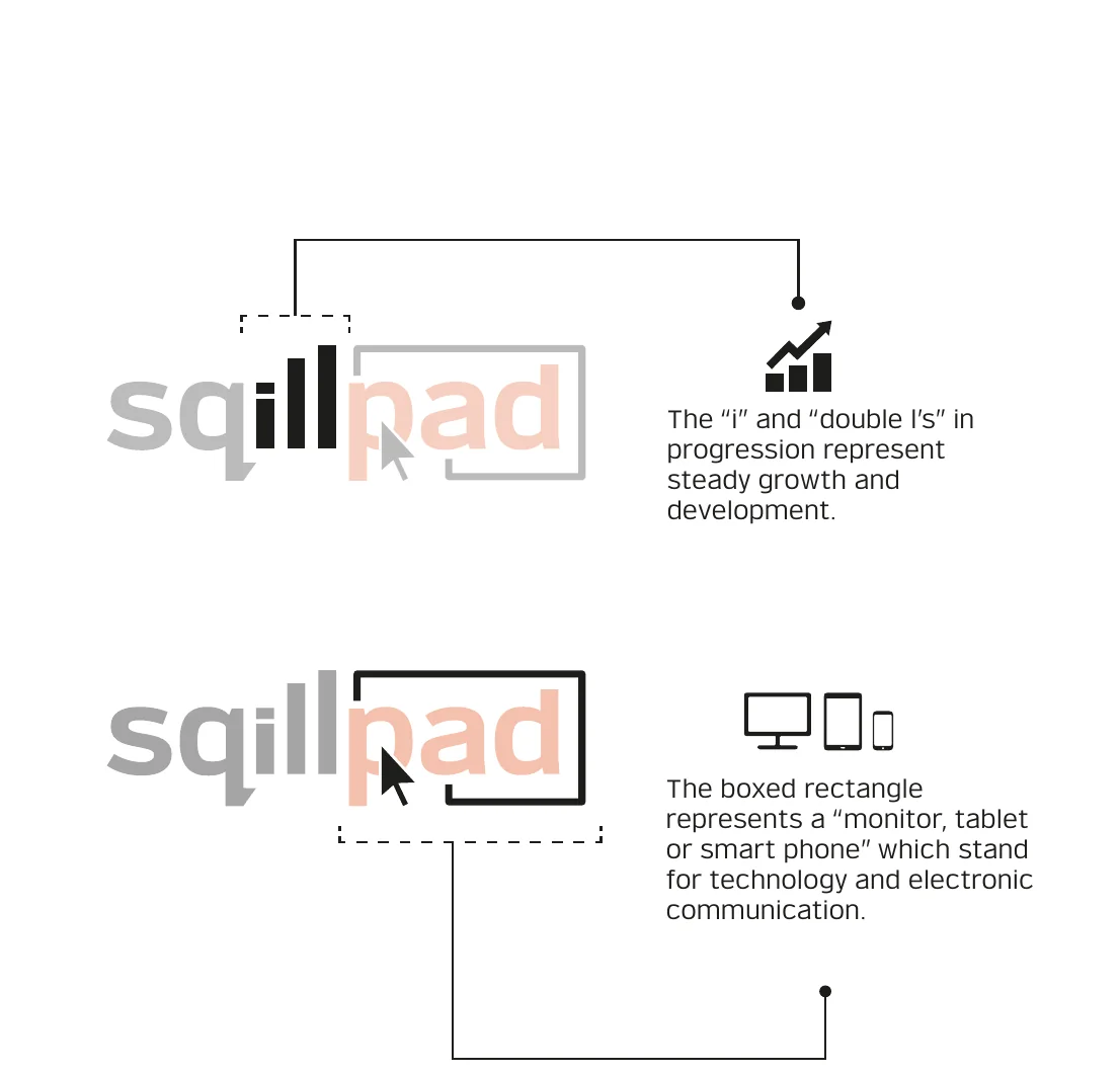
1 · Steady growth
Letters rising in progression represent steady growth and development.
2 · The screen
It stands for a monitor, tablet or smartphone: technology and electronic communication.
3 · The wordmark
The logo has three elements: a word mark that is minimal and sharp, an icon for technology, and iconic letters that represent growth.

03The strategyMission · Vision · Positioning
The mission is written as a sentence with three jobs. Pick one to read it on its own.
To unlock the productive potential of Africa’s human capital by providing dynamic digital tools that channel the learners’ curiosity towards their intellectual growth.
Vision
Highly enlightened African talent providing world class solutions to humanity.
Brand positioning
By choosing to learn with Sqillpad, one becomes a member of Uganda’s first NCDC approved e-learning community for primary and secondary school learners.
The promise
Sqillpad is a learner-centred platform that allows you to learn at your own pace.
04The voiceAudience · Tone
A learner, a teacher and a parent all open the same page for different reasons. The tone has to work for all three: simple to understand, polite, appealing, enthusiastic, credible and respectful.
Primary and secondary school learners in schools running the Ugandan curriculum.
Primary and secondary school teachers in schools running the Ugandan curriculum.
Parents with children in primary and secondary schools running the Ugandan curriculum.
Tone of voice
The brand encourages consistency, transparency, quality and civility, and the essence of its alphabets must express who it is. Work is conveyed through presentations, plans, brochures, leaflets, the internet and social media.
05The logoRules that survive a busy school week
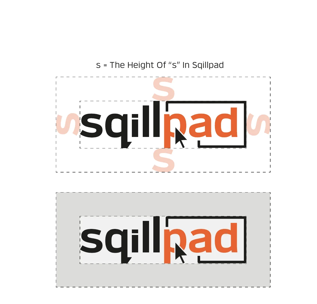
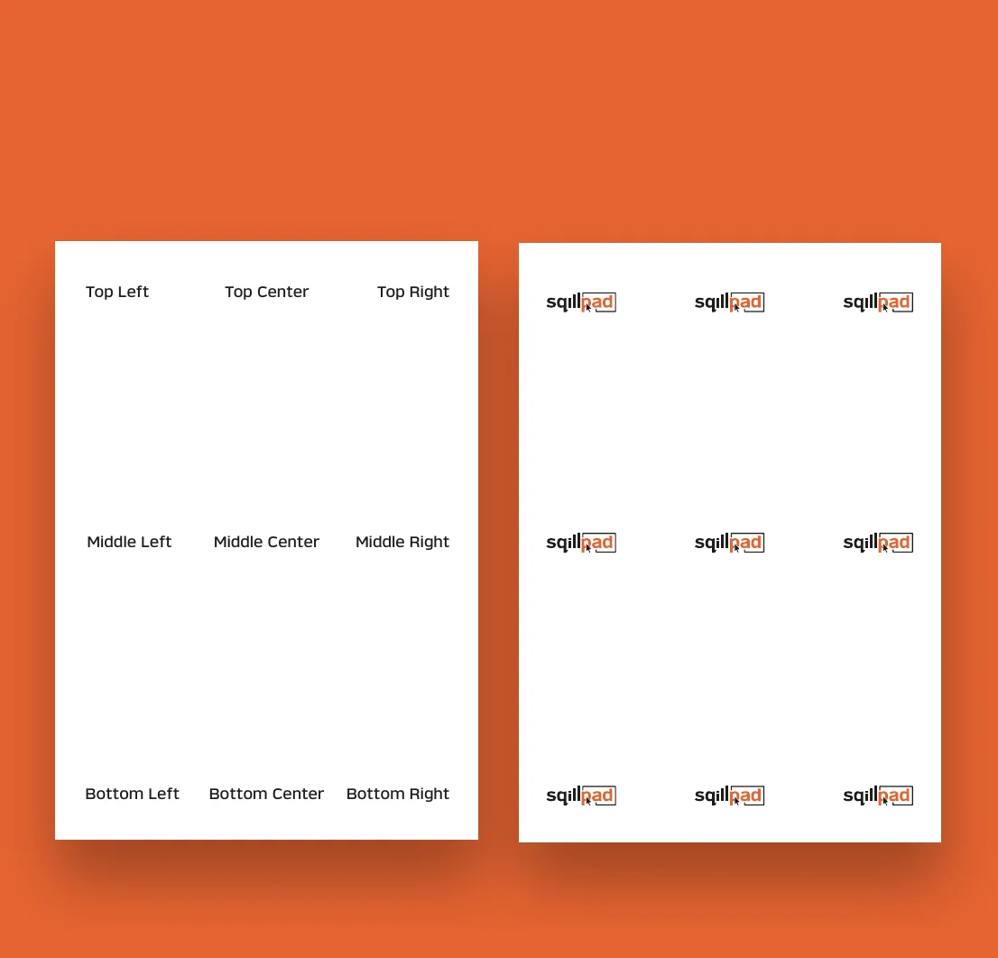
The logo is only permitted on four backgrounds, with or without its tagline. Try them. The tagline always uses Verbatim Regular at kerning 110.

Minimum size
Drag to shrink the main logo. Below the minimum the manual says no.

Minimum size or larger
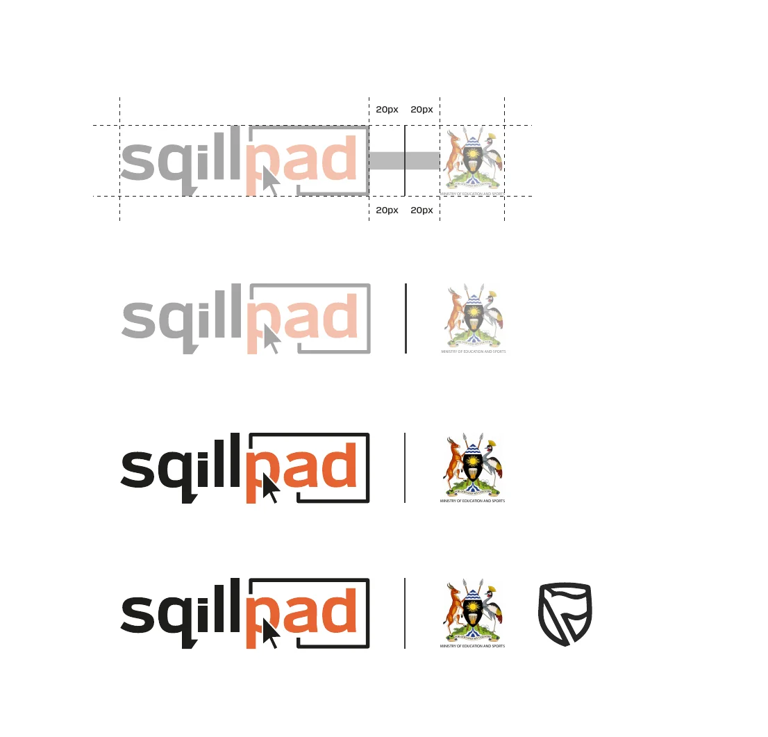
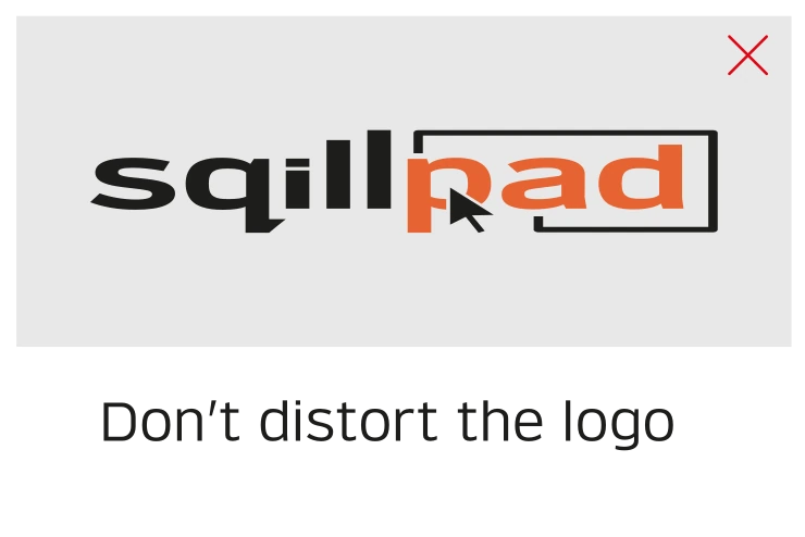
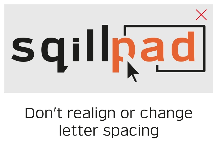
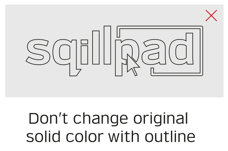
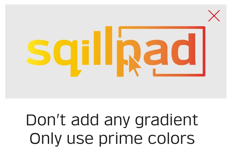
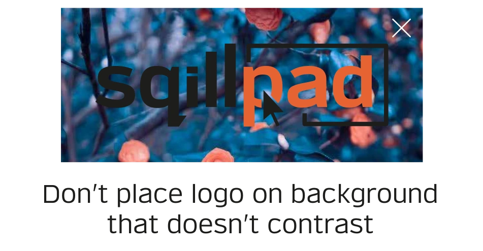
Never this

06The colourFlame and Eerie Black, with a green and a gold
Flame Orange and Eerie Black lead the identity. Dartmouth Green and Gamboge step in as substitutes for different backgrounds and design settings. Hover a block, tap it for the codes, click to copy.
Prime colour
#EB6432
RGB 235 · 100 · 50
CMYK 1 · 71 · 83 · 0
Secondary colour
#057632
RGB 5 · 118 · 50
CMYK 96 · 0 · 58 · 54
Secondary colour
#E49600
RGB 228 · 150 · 0
CMYK 0 · 34 · 100 · 11
The one gradient
Used only with a primary colour. Anything else is on the incorrect-usage list.
07The typeOne for slides, one for everywhere
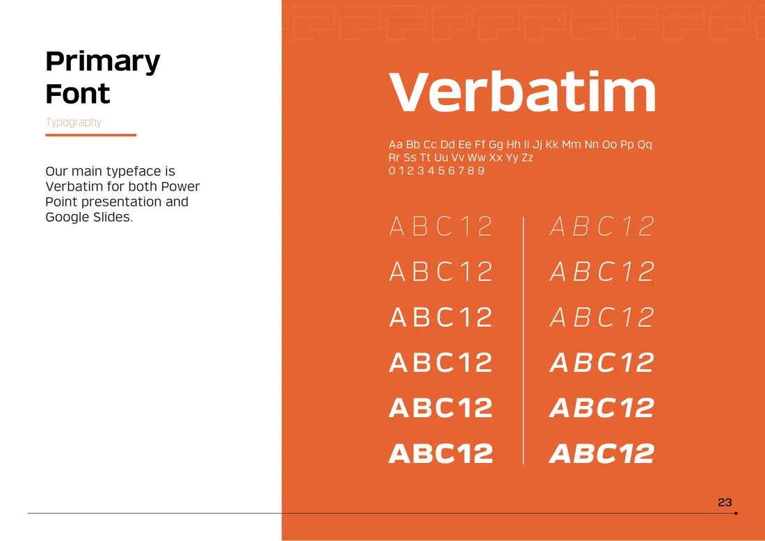
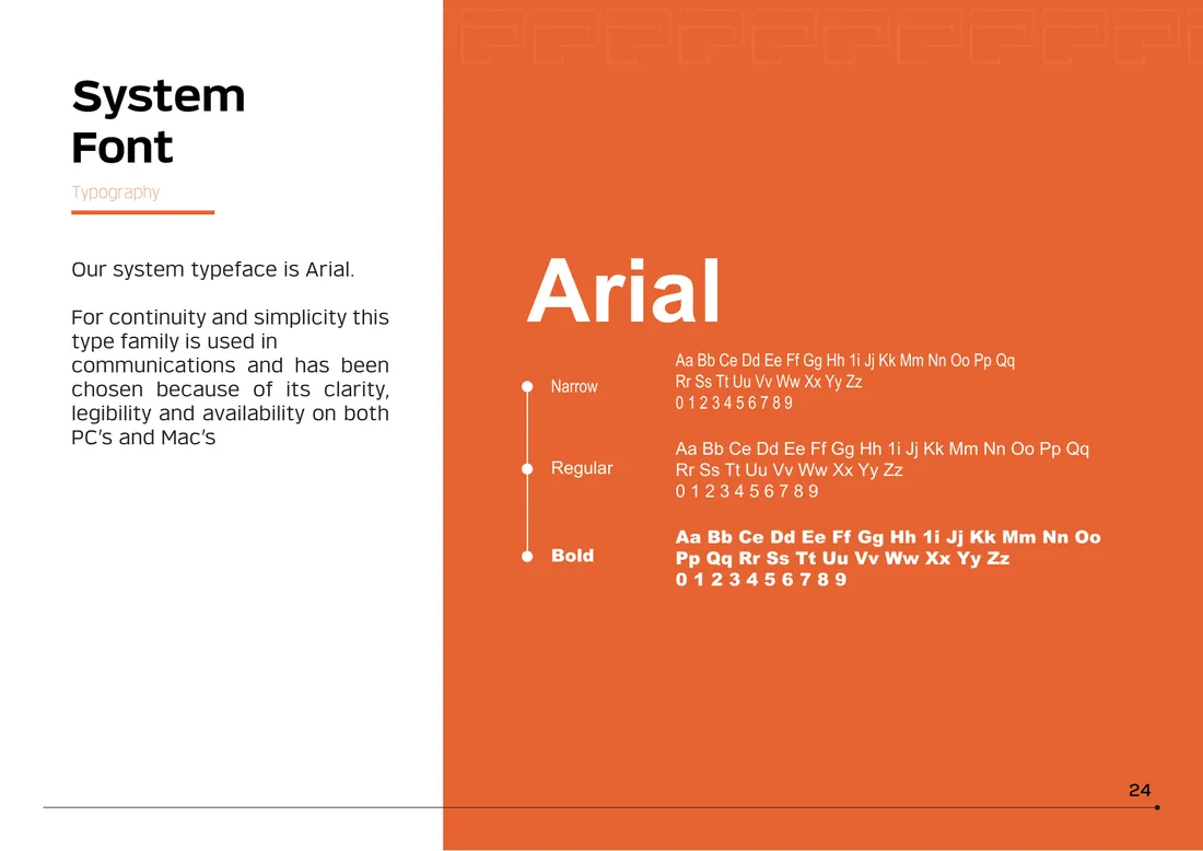
Verbatim is the main typeface, used in PowerPoint and Google Slides, and for the tagline, business cards and letterheads. Arial is the system font: clear, legible and already on every PC and Mac.
Primary
The brand’s main typeface for presentations, tagline and stationery.
System
Narrow, regular and bold. Chosen for continuity, simplicity and availability.
08The languageIcons · Pattern
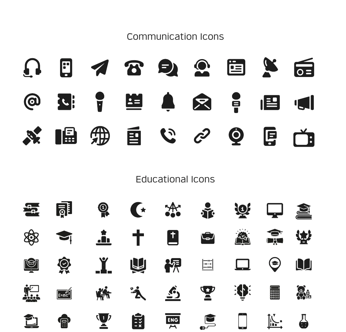
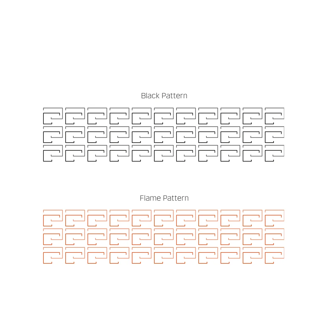
The logo’s screen shape repeats as a pattern for backgrounds. Try it on the brand colours. Filled icons cover communication and education; outlined icons are for the PowerPoint template only.
Ground
Strength
For any collateral that needs a visual texture behind it.
09The manualCorporate Identity Manual · Version 1.0
Introduction, brand logo, typography, colour, graphic language and brand application. “The Sqillpad logo serves as a representation of our company and everything we stand for. It must be accurately and consistently communicated.”
10The rolloutBrand application
The manual shows the identity at work on twenty items: the office, the classroom, the event stand and the road. Filter them, then open any one.
20 items shown
11The templatesEditable in Adobe Illustrator and PowerPoint
Each template in the package is fully editable, with its dimensions written into the manual. Pick one to see its true proportions.
What was handed over
Open each folder to see what the team received.
Next case file
05 · Sqillpad Care Centre, where tablets are bought, repaired and explained.
Final chapter · The launch
Your brief